How working with artists and designers can boost your marketing efforts
Last weekend I went to see the Interior Design Show in Toronto. I used to regularly travel to Toronto from Montreal to see the show a couple of years ago. It used to be an inspiring pilgrimage for me to see what new amazing products and design ideas were emerging. It has changed since the last time I was there. There were a couple interesting installations and booths, but one thing that caught my attention was how the exhibitors who collaborated with a creative person or team were a lot more visible on social media. The most obvious examples of this was between three paint companies present at the show: Beauti-Tone by Home Hardware, Premier paint by Canadian Tire and Benjamin Moore.
All three seemed to have similar sized booths, but each took a different approach to essentially connect with current and potential clients. In an age where everything happens online, it seems like the first two had a better grasp on what to do to get people interested and talk about their products outside of the show. This led me to better understand the impact a creative person or team can have on a business and how collaborating with creatives can positively boost marketing efforts for businesses and products so they can stand effectively out from the crowd. Based on what I saw at the show and online, the winner was Beauti-Tone, closely followed by Premier. Unfortunately for Benjamin Moore, they seem to be lagging behind. Here's why:
Beauti-Tone grabbed people's attention by collaborating with a fashion designer
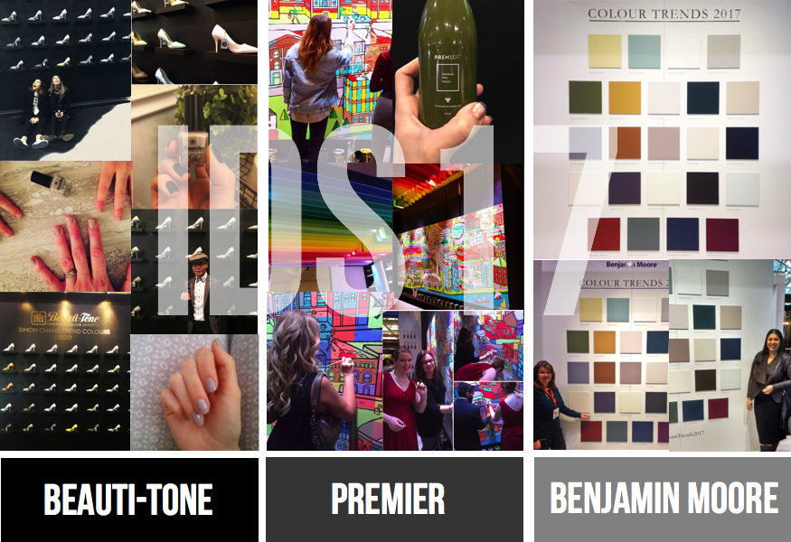
Beauti-Tone partnered with fashion designer Simon Chang and they came up with a unique and creative way to present their colour palette for 2017 : a wall of painted shoes using each of the trendy colours. By creating such a beautiful wall, they were able to reach more viewers online through social media. I actually saw a photo of it on Instagram before even seeing it at the show. I realized after clicking on the photo that it was part of the interior design show. It's such a original wall that many people (including myself) felt compelled to take a picture and post it online, which resulted in free advertising for their product and brand.
They didn't stop there. Their booth was beautifully appointed for an interior design show. They had a space showcasing their paint in a dining room. They also took the time to create a shelving wall featuring various items painted in their feature colour for 2017. The lady at the booth was very welcoming, she made sure the we took one of the paint samples and a nail polish of the same colour before we left. Not only did they appear on many social media accounts, they also created a lasting effect in people's mind because that nail polish is basically mobile advertising for them whenever they use it. Genius!

They left a great impression in my mind and I'm definitely going to use their paint and nail polish. What makes them the winner for me is that they extended the attention on their brand by giving each visitor something to go home with and showcase online.
A couple days after the show, doing a search for #beautitone, I found these pictures of women showing off their colour trend nail polish, essentially continuing to advertise for Beauti-Tone.
It took someone from the fashion industry to come up with a unique way for the paint company to increase attention towards their brand.
Premier got people using their product by partnering with a design firm
Premier paint had a great booth for people to spend time in and interact with the paint. They collaborated with Citizens and Collaborators, a design firm, to create an interactive mural enabling visitor to paint on the wall and essentially get a feel for their paint while having fun. They also had a really beautiful rainbow ceiling and a juice bar featuring some of their colours through juices. Again, their booth was advertised quite a bit through social media from people taking pictures of the ceiling and the evolving wall, as more people came to add more colour to the wall. It was a very inviting space and the people at the entrance of the booth made sure to ask people carrying magazine if they needed a bag to hold them. Their also won an award for best booth design. They came in second for me because they didn't have something like Beauti-tone to keep their brand on people's feed after the show ended.
It took a design firm to come up with a fun and effective way to get potential clients to try their products.
Benjamin Moore didn't get much attention online
I was a little disappointed by the booth from Benjamin Moore. Their paint is so much better then how it was presented at the show. As you can see below, there were a couple painted squares on a white wall to showcase their colour palette, a giant poster featuring the colour the year and a sitting area that reminded me more of an office and a box for people to pick up a bag on the outskirt of their booth with the word Shadow on it. Womp. Womp.
The booth was kind of boring. Everything looked very "corporate" and there was nothing special enough to grab people's attention or entice visitors to take multiple pictures and post them online for extra reach. I only found 3 photos of visitors standing next to the colour trend wall : giant paint swatches. They weren't even mention on the official Instagram of the show (at least I didn't find them), which to me says a lot. They would benefit a lot from partnering with creatives to come up with unique and inspiring ways to showcase their products and make their booth more exciting, because we creatives are great at thinking outside of the box.
The booth was kind of boring. Everything looked very "corporate" and there was nothing special enough to grab people's attention or entice visitors to take multiple pictures and post them online for extra reach. I only found 3 photos of visitors standing next to the colour trend wall : giant paint swatches. They weren't even mention on the official Instagram of the show (at least I didn't find them), which to me says a lot. They would benefit a lot from partnering with creatives to come up with unique and inspiring ways to showcase their products and make their booth more exciting, because we creatives are great at thinking outside of the box.
Here's what I thought about when I saw their booth :
1. Why didn't they make better use of the their featured colour?
Shadow is such a dramatic colour. Instead of embracing the drama by using the colour in larger quantity, the only had it on a small narrow wall with their logo on it. Also, flanking the poster with white paint on each end takes away from the drama. Perhaps having more wall or even recreating one of the scene from their brochure using their colour of the year, so that visitor can really feel what it's like to be in a room with that colour would have given them a more memorable experience, and something to share online. It feels like they missed the opportunity to impress the visitors.
2. Why didn't they collaborate with other exhibitors?
 Another way to stay in people's mind is to be in as many places as possible. One thing they could have done with their feature colour is to offer exhibitor to paint their wall in exchange for a shoutout. A product such as Gweilo light by Partisans would have been an ideal partnership. It's a great product featuring a sculptural light that is best seen against a dark background. They didn't have one so their product didn't show as well as it could have. Benjamin Moore could have provided them with a simple painted partition wall and floor with a discrete sign identifying themselves and the name of the paint. The light fixture would have stand out more. Beside, how cool is the analogy of having Shadow paint to feature a lighting product!
They also missed an opportunity to collaborate with DEKKO Concrete (right behind their booth) who could also have benefited from a dark floor to enhanced their light concrete wall and their beautiful fire pit.
There was also a sculptor on the other side of the exhibition room called CEK who had these amazing concrete sculptures, some with light, which would have looked amazing against a dark wall, and again it would have been an opportunity for Benjamin Moore to show how their featured paint colour can enhance light coloured furniture and artworks.
There was also a sculptor on the other side of the exhibition room called CEK who had these amazing concrete sculptures, some with light, which would have looked amazing against a dark wall, and again it would have been an opportunity for Benjamin Moore to show how their featured paint colour can enhance light coloured furniture and artworks.
3. Why didn't they do something a little more creative with their colour palette?
The large coloured square on the wall is so uninspiring. I would think most people would pass by it and keep walking. It's not much different then seeing it on the catalogue. One simple way they could have make it more interesting would have been to used 3-D shadow boxes instead of flat squares and put fun objects inside the boxes, painted the same colour to give a bit more interest, texture and interest in the colour. Imagine if they would have taken random items painted the same colour as the boxes and create a story within the boxes that somehow connects to the name of the colour. I think that would have been shared on social media.
By not collaborating with creatives, they missed a lot of opportunities to increase their reach and consequently increase their sales.
Overall it was a great experience for me to visit the show as I'm getting a better understanding of how art plays an important role in businesses and how the return on investment when it comes to creativity can be quantified. Don't underestimate the power of creativity and how it can positively impact your business's bottom line!


